Dr. Delminquoe L Cunningham
Project Outcomes at a Glance
Success Rate +50%
Task success skyrocketed from a frustrating 45% on the legacy tool to a confident 95% on the new MVP.
-60% Time on Task
We slashed the average time to complete a core compliance task from 120 seconds down to just 48 seconds.
SaaS Enabled
The redesign transformed an internal utility into a commercial product, enabling sales to major financial partners.
Project Details
My Roles
- Senior UX/UI Designer
- UX Researcher
- Service Designer
- Interaction Designer
- Design System Governance
Timeline
Two Years
Tools & Methods
- Figma & Figjam
- Optimal Workshop
- Qualtrics
- Jira
Project Details
The Challenge: A System at Breaking Point
Equifax’s analysts were fighting a daily battle with their tools. The 20-year-old legacy platform was a dense wall of data that forced users to open multiple browser tabs just to research a single case. It was slow, prone to crashing, and visually overwhelming. This inefficiency wasn’t just annoying—it created regulatory risks and made it impossible for the business to sell the tool to external clients like JP Morgan or Wells Fargo.
Understanding the Users
We couldn’t just “skin” the old app; we needed to understand the people using it. Through interviews and workshops, we identified three distinct personas with conflicting needs:
- Eleanor (“The Regulator”): Needs absolute precision and audit trails. She feared the old system’s data discrepancies.
- Ben (“The Data Detective”): Wants speed and keyboard shortcuts. He hated the slow load times and mouse-heavy workflows.
- Maria (“The Business Partner”): Needs clear communication tools to explain compliance decisions to business units.
The "Aha!" Moment
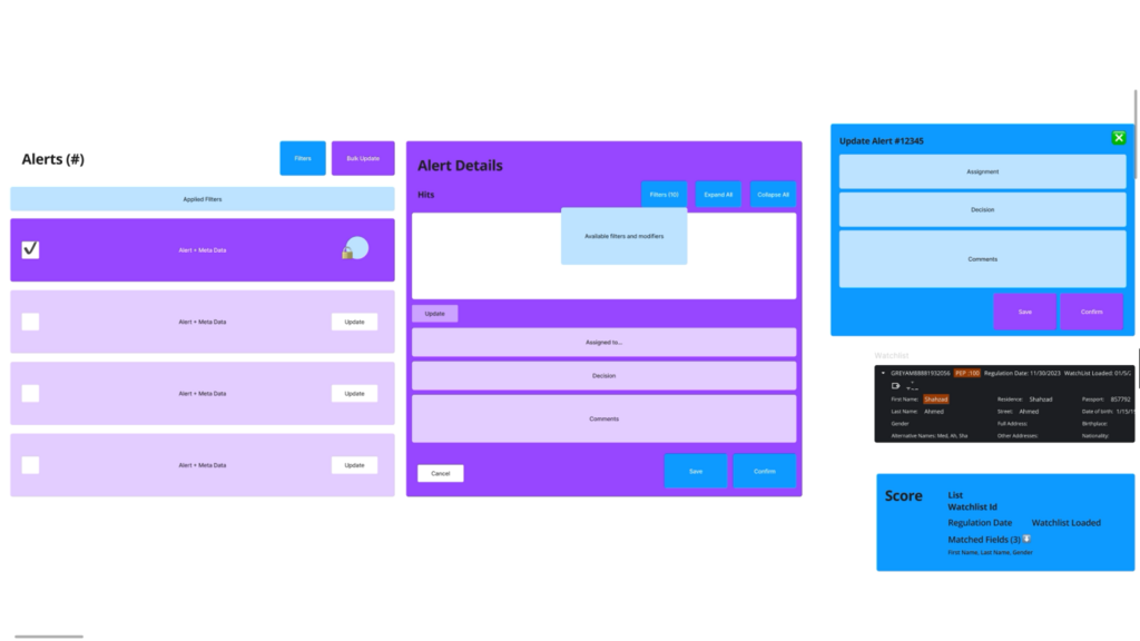
During our workflow analysis, we realized that the core task of compliance—triaging alerts, investigating details, and making a decision—mirrored a pattern everyone already knew: Email.
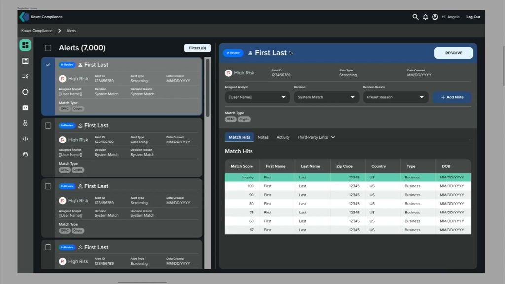
We shifted our design strategy to use a familiar “Inbox” mental model. This meant a persistent list on the left and a detailed workspace on the right, eliminating the need for those frustrating browser tabs.
The Solution: Kount Compliance MVP
The final design delivered a clean, two-column interface that balanced density with clarity.
- Unified Workspace: We killed the “tab tax.” Analysts can now view the queue and the case details on a single screen.
- Tabbed Data: Complex information (Sanctions, Adverse Media, PEPs) was organized into tabs, reducing cognitive load.
- Bulk Actions: We added the ability to select multiple alerts and disposition them instantly—a huge win for our power users like Ben.
Validation & Impact
We didn’t just guess; we tested. In a head-to-head A/B test with 15 participants, the results were undeniable.
Key Takeaways
The success of Kount Compliance reinforced that the most effective designs often leverage patterns users already know. By shifting to a familiar “Inbox” model, we didn’t just speed up workflows; we virtually eliminated the learning curve.
Dr. Delminquoe L Cunningham is proudly powered by WordPress