Dr. Delminquoe L Cunningham
Project Outcomes at a Glance
+35% Engagement
Shared notes and book clubs drove community engagement, causing a massive spike in daily interaction.
4.8 Star Rating
App store reviews highlighted the intuitive design and unique social features, driving a high rating.
+20% Active Users
The new social ecosystem built a ‘sticky’ experience that encouraged active users to return daily.
Project Details
My Roles
- UX/UI Designer
- Lead Researcher
- Team Lead
Timeline
- Six Months
Tools & Methods
- Figma (Prototyping)
- Miro (User Flows)
- Maze (Testing)
- Affinity Mapping
- User Interviews
- Surveys
Project Assets
The Challenge: The "Lonely Reader" Problem
Our research revealed a paradox: while reading is a solitary activity, the *joy* of reading often comes from sharing it. Customers loved the physical bookstore for its recommendations and conversations, but once they left, they felt disconnected. Existing e-reader platforms were sterile and lacked robust community features, leaving a gap between the digital convenience users wanted and the human connection they craved.
My Approach: Research-Led Empathy
We couldn’t just guess what users wanted. I led a robust research phase involving 50 participants to dig deep into behaviors. We used a mixed-method approach—combining 20 in-depth interviews with a broader quantitative survey—to validate our assumptions. This helped us move past the generic “social network for books” idea and focus on what really matters: intimacy and trusted curation.
From Insight to Action
The data from our 50 participants uncovered four key insights that directly shaped the MVP:
- Intimacy Over Noise: Users didn’t want another massive public forum like Goodreads. They wanted small, private spaces—”digital living rooms”—to talk with people they actually knew.
- The “Book Hangover”: 72% of users struggled to find their next book. They trusted friends over algorithms, so we pivoted the discovery feed to highlight friend activity first.
- Shared Context: Users wanted to share specific passages, not just general thoughts. We designed a “Shareable Annotation” feature to let users highlight text and push it directly to a book club discussion.
- Logistical Friction: Coordination was a major pain point for book clubs. We decided to build scheduling tools directly into the app to solve this administrative headache.
The Solution: A Companion App
The final design for Book Nook isn’t just an e-reader; it’s a hub for the store’s community.
- Private Book Clubs: Users can easily create invite-only clubs, complete with chat channels, meeting schedulers, and progress tracking.
- The “Shop Local” Connection: A direct link to the brick-and-mortar store allows users to check inventory and order physical copies for pickup, driving foot traffic back to the shop.
- Social Reading: The reading interface allows for “social highlighting”—seeing where friends have left notes (if shared) creates a feeling of reading together, even when apart.
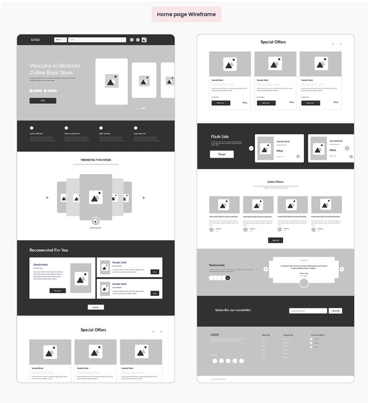
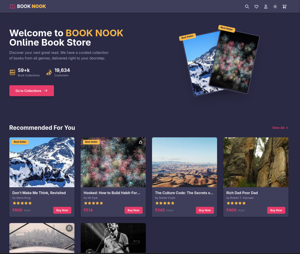
Final Comparison Before our Proposal and After
Key Takeaways
This project proved that digital experiences don’t have to compete with physical retail—they can enhance it.
Ultimately the store did not choose to move forward with our pitch but it was a great exercise in market research and information architecture.
Dr. Delminquoe L Cunningham is proudly powered by WordPress