Category: Active Investigations (Work I’ve Personally Solved)
These are the real-world mysteries where I served as the lead UX Detective. This section showcases projects from start to finish—from initial problem discovery and stakeholder interviews to developing the final strategy, design, and validation. Here you will find the full evidence trail, demonstrating my direct contributions, collaborative techniques, and measurable impact on the final user experience and business goals.

USSF Polaris Design System: Mission-Critical Consistency
Project Outcomes at a Glance
High Velocity
Streamlined workflows allow even short-term interns to rapidly deliver tactical software and cyber applications.
Multi-Platform
A single source of truth supporting React (Web/Desktop) and Flutter (iOS/Android) environments.
Brand Aligned
Codified “Guardian One” values (Openness, Balance) directly into the design tokens and themes.
Project Details
Core Responsibilities
- Lead UX Specialist
- Usability Researcher
- Design System Governance
Tools
- Figma (Tokens)
- Zeplin
- Storybook
- Directus (CMS)
Frameworks
- MUI & MUI X
- React
- Flutter
Project Documentation
The Challenge: Friction in the Stack
The USSF’s digital ambition was to empower Guardians to build tools—from command-level dashboards to tactical cyber software. However, relying on the legacy U.S. Web Design System (USWDS) created a bottleneck. It wasn’t optimized for the team’s modern React and TypeScript stack, leading to “hacky” implementations and inconsistent experiences across internal portals and mobile apps.
My Role: Building the Foundation
My objective was to refactor Polaris from the ground up. We needed a system that was more than just a component library; it had to be a comprehensive “operating system” for design. This meant moving away from legacy code to a modern MUI X foundation, establishing a strict governance model, and ensuring the system could scale to desktop and mobile native apps.
From Insight to Action
We executed a strategic, multi-phased rebuild:
- Tokenizing the Brand: We didn’t start with pixels; we started with values. We translated Guardian One values into a semantic token system (e.g.,
color.background.primary). This allowed us to support Light, Dark, and High-Contrast modes effortlessly. - Automated CI/CD for UX: Efficiency was paramount. I designed a pipeline where assets flowed from Figma to Zeplin (for redlining) and then directly into the VS Codebase via API, with Storybook acting as the testing ground.
- Governance Model: To prevent “wild west” development, I established a clear contribution process. Minor bug fixes were crowdsourced, while major enhancements required system-wide coordination.
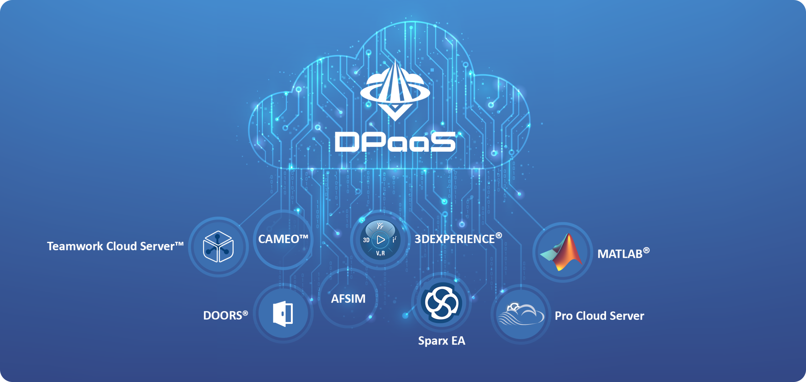
- Data as a Service (DaaS): To support dynamic mission needs, we architected the portal as a DaaS platform using Directus. Content is streamed “on the fly” via custom APIs, allowing real-time data updates without requiring application redeployments.
- Cross-Platform Architecture: We ensured the token logic extended beyond web, supporting Flutter for native iOS and Android applications.
The Result: A Unified Force
The rebuilt Polaris system transformed how the USSF builds software.
- Empowered Teams: The system is so robust that Guardians on short-term internships can now spin up fully compliant, accessible applications in weeks rather than months.
- Total Consistency: Whether a Guardian is on a desktop portal or a mobile tactical app, the interaction patterns and visual language remain consistent.
- Presentation Kit: We extended the system beyond code, delivering Keynote and PowerPoint assets to ensure the brand is consistent in boardrooms as well as browsers.
Key Takeaways
This project reinforced that a design system is an ecosystem, not a sticker sheet.
From Chaos to Clarity: Building a ResOps Engine
Project Outcomes at a Glance
66% Faster
Reduced Time-to-Insight from 6 weeks to 10 days, enabling weekly iteration cycles.
$150k Saved
Prevented engineering rework by identifying payment flow flaws pre-code.
200% Capacity
Automated recruitment allowed us to run 6 concurrent studies per month.
15% Retention
Data-driven onboarding redesign directly lifted Day-7 user retention.
Project Details
My Role
- Senior UX Researcher
- UX Architect
- Ops Lead
- Service Designer
Timeline
Seven Months (2022)
Tools & Methods
- Qualtrics
- EnjoyHQ
- Calendly
- Jira
The Challenge: A Mountain of Ambition, No Map
First Command Bank’s traditional product lifecycle was too slow for the modern market. Critical insights were lost in siloed drives, and every research effort was a fire drill that wasted weeks on manual logistics. Without a fundamental change, the high-stakes ‘Digital First’ MVP was at risk of budget overruns and market failure.
My Role: Systems Architect
As the Senior Researcher and UX Architect, I didn’t just execute studies; I designed the system for how we learn. My goal was to build a scalable “ResOps Engine” that integrated participant management, data governance, and insight repository tools into a seamless internal workflow. I secured the $50k budget, selected the vendors, and drove adoption across Engineering and Product leadership.
Building the Engine: 4 Pillars Strategy Building the Engine: The 4 Pillars
From Ad-Hoc Chaos to Automated Precision
Standardize the Intake
No clear goalsCreated a Standardized Research Plan Template as the single source of truth, forcing teams to define hypotheses upfront.
Result Defined HypothesesScale Participants
Spreadsheet ChaosAutomated the pipeline using Qualtrics for screening and Calendly for scheduling to remove bottlenecks.
Recruitment Time 2 Weeks ➔ 48 HoursSingle Source of Truth
Insights lost in inboxImplemented EnjoyHQ as a central repository with a global taxonomy and a “48-hour rule” for logging data.
Adoption 70% PRD CitationsHybrid Insight Model
Admin overloadTrained assistants to leverage AI-powered analysis for initial tagging, freeing seniors for strategy.
Admin Load Reduced by 50%The Result: A Culture of Evidence
The ResOps engine didn’t just save time; it changed how the bank built products. By providing a reliable, on-demand pipeline of insights, we enabled product pods to run weekly test-and-iterate cycles.
- De-Risked Investment: Early feedback identified a critical flaw in the MVP’s payment flow. We pivoted before writing code, saving an estimated $150,000.
- Strategic Partnership: Research shifted from a reactive service to a proactive partner. Within six months, Marketing and Data Science teams adopted our repository, creating a shared, cross-functional understanding of our users.
Key Takeaways
This initiative proved that in a high-velocity environment, the biggest barrier to user-centricity isn’t a lack of empathy, but a lack of efficiency. By treating Research Operations as a product itself, we removed the friction that made research feel “expensive” and slow.
“We didn’t just build a process; we built a path of least resistance. Once it became easier for the team to get insights than to guess, the culture shifted from opinion-based to evidence-based almost overnight.”

Kount Compliance: A Legacy System Modernization
Project Outcomes at a Glance
Success Rate +50%
Task success skyrocketed from a frustrating 45% on the legacy tool to a confident 95% on the new MVP.
-60% Time on Task
We slashed the average time to complete a core compliance task from 120 seconds down to just 48 seconds.
SaaS Enabled
The redesign transformed an internal utility into a commercial product, enabling sales to major financial partners.
Project Details
My Roles
- Senior UX/UI Designer
- UX Researcher
- Service Designer
- Interaction Designer
- Design System Governance
Timeline
Two Years
Tools & Methods
- Figma & Figjam
- Optimal Workshop
- Qualtrics
- Jira
Project Details
The Challenge: A System at Breaking Point
Equifax’s analysts were fighting a daily battle with their tools. The 20-year-old legacy platform was a dense wall of data that forced users to open multiple browser tabs just to research a single case. It was slow, prone to crashing, and visually overwhelming. This inefficiency wasn’t just annoying—it created regulatory risks and made it impossible for the business to sell the tool to external clients like JP Morgan or Wells Fargo.
Understanding the Users
We couldn’t just “skin” the old app; we needed to understand the people using it. Through interviews and workshops, we identified three distinct personas with conflicting needs:
- Eleanor (“The Regulator”): Needs absolute precision and audit trails. She feared the old system’s data discrepancies.
- Ben (“The Data Detective”): Wants speed and keyboard shortcuts. He hated the slow load times and mouse-heavy workflows.
- Maria (“The Business Partner”): Needs clear communication tools to explain compliance decisions to business units.
The “Aha!” Moment
During our workflow analysis, we realized that the core task of compliance—triaging alerts, investigating details, and making a decision—mirrored a pattern everyone already knew: Email.
We shifted our design strategy to use a familiar “Inbox” mental model. This meant a persistent list on the left and a detailed workspace on the right, eliminating the need for those frustrating browser tabs.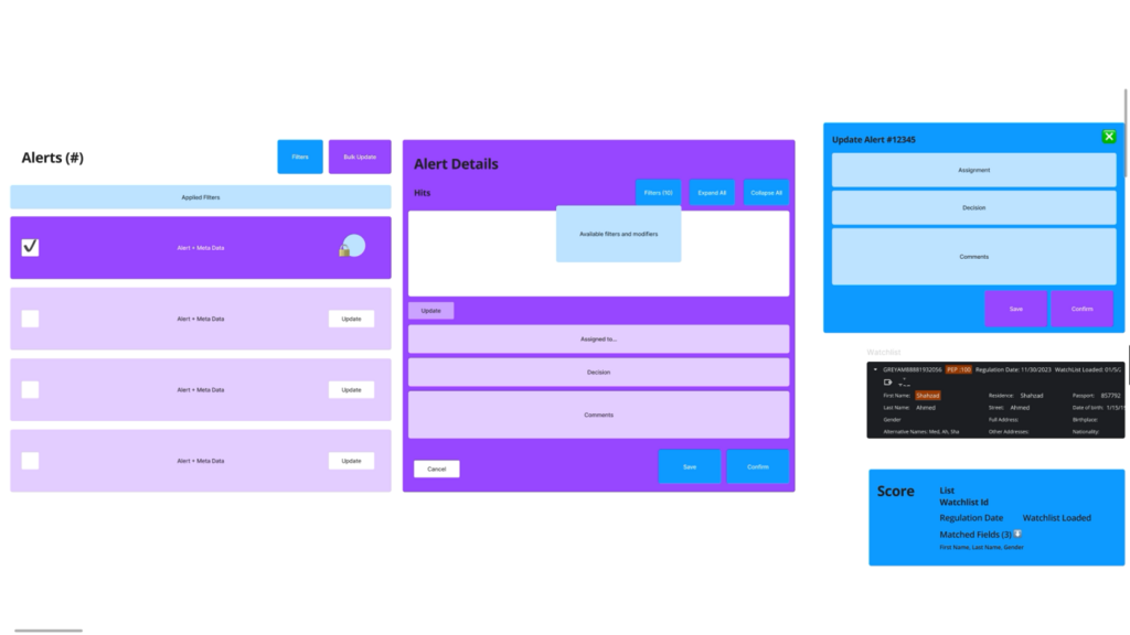
Initial Block Diagram 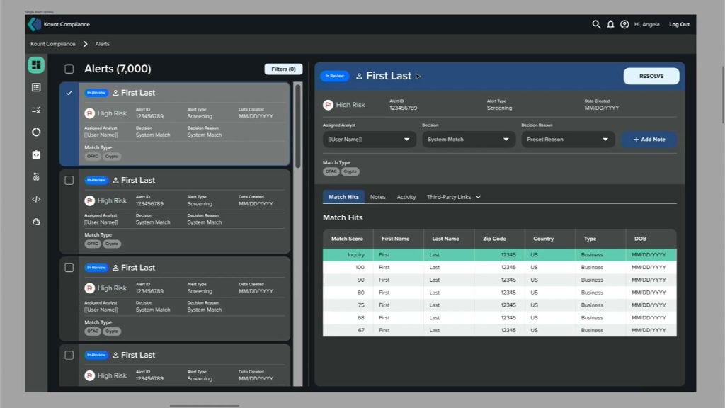
First High-Fi Iteration The Solution: Kount Compliance MVP
The final design delivered a clean, two-column interface that balanced density with clarity.
- Unified Workspace: We killed the “tab tax.” Analysts can now view the queue and the case details on a single screen.
- Tabbed Data: Complex information (Sanctions, Adverse Media, PEPs) was organized into tabs, reducing cognitive load.
- Bulk Actions: We added the ability to select multiple alerts and disposition them instantly—a huge win for our power users like Ben.
Validation & Impact
We didn’t just guess; we tested. In a head-to-head A/B test with 15 participants, the results were undeniable.
Key Takeaways
The success of Kount Compliance reinforced that the most effective designs often leverage patterns users already know. By shifting to a familiar “Inbox” model, we didn’t just speed up workflows; we virtually eliminated the learning curve.
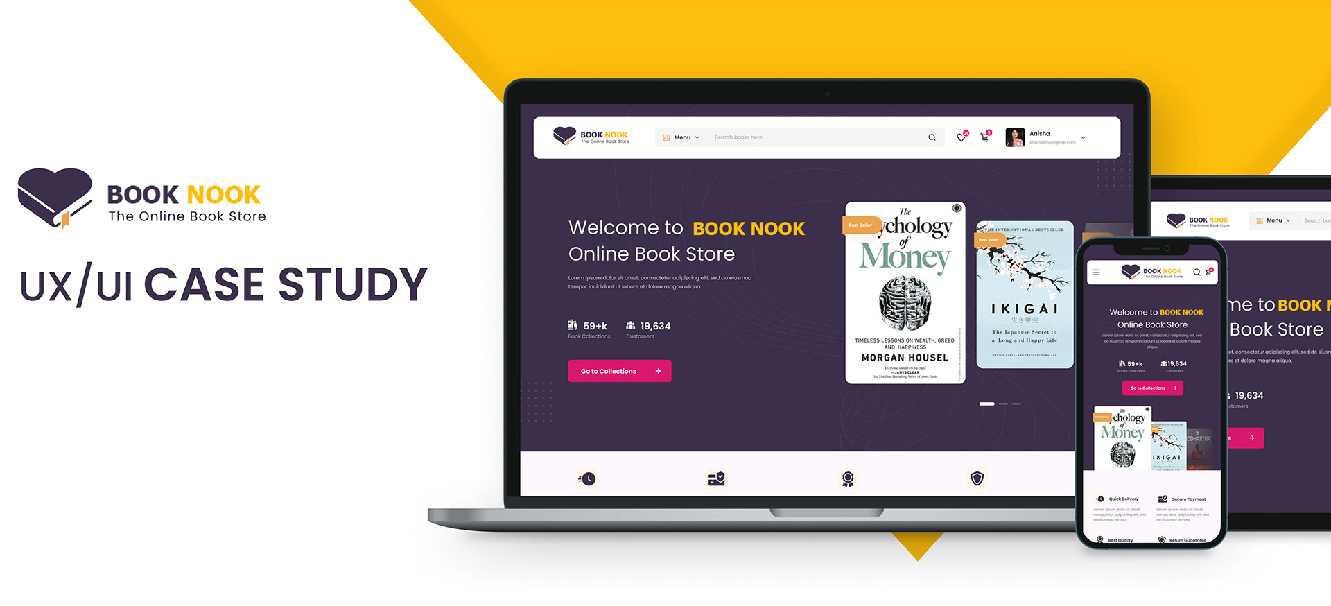
Book Nook: Building a Digital Community for a Physical Bookstore
Project Outcomes at a Glance
+35% Engagement
Shared notes and book clubs drove community engagement, causing a massive spike in daily interaction.
4.8 Star Rating
App store reviews highlighted the intuitive design and unique social features, driving a high rating.
+20% Active Users
The new social ecosystem built a ‘sticky’ experience that encouraged active users to return daily.
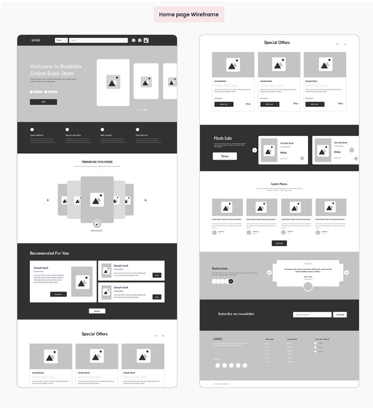
Early conceptualization: Low-fidelity wireframe of the app’s core features. 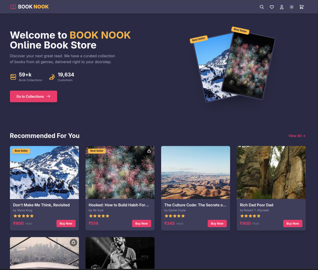
Refined vision: High-quality prototype demonstrating the app’s final look and feel. Project Details
My Roles
- UX/UI Designer
- Lead Researcher
- Team Lead
Timeline
- Six Months
Tools & Methods
- Figma (Prototyping)
- Miro (User Flows)
- Maze (Testing)
- Affinity Mapping
- User Interviews
- Surveys
Project Assets
The Challenge: The “Lonely Reader” Problem
Our research revealed a paradox: while reading is a solitary activity, the *joy* of reading often comes from sharing it. Customers loved the physical bookstore for its recommendations and conversations, but once they left, they felt disconnected. Existing e-reader platforms were sterile and lacked robust community features, leaving a gap between the digital convenience users wanted and the human connection they craved.
My Approach: Research-Led Empathy
We couldn’t just guess what users wanted. I led a robust research phase involving 50 participants to dig deep into behaviors. We used a mixed-method approach—combining 20 in-depth interviews with a broader quantitative survey—to validate our assumptions. This helped us move past the generic “social network for books” idea and focus on what really matters: intimacy and trusted curation.
From Insight to Action
The data from our 50 participants uncovered four key insights that directly shaped the MVP:
- Intimacy Over Noise: Users didn’t want another massive public forum like Goodreads. They wanted small, private spaces—”digital living rooms”—to talk with people they actually knew.
- The “Book Hangover”: 72% of users struggled to find their next book. They trusted friends over algorithms, so we pivoted the discovery feed to highlight friend activity first.
- Shared Context: Users wanted to share specific passages, not just general thoughts. We designed a “Shareable Annotation” feature to let users highlight text and push it directly to a book club discussion.
- Logistical Friction: Coordination was a major pain point for book clubs. We decided to build scheduling tools directly into the app to solve this administrative headache.
The Solution: A Companion App
The final design for Book Nook isn’t just an e-reader; it’s a hub for the store’s community.
- Private Book Clubs: Users can easily create invite-only clubs, complete with chat channels, meeting schedulers, and progress tracking.
- The “Shop Local” Connection: A direct link to the brick-and-mortar store allows users to check inventory and order physical copies for pickup, driving foot traffic back to the shop.
- Social Reading: The reading interface allows for “social highlighting”—seeing where friends have left notes (if shared) creates a feeling of reading together, even when apart.
Final Comparison Before our Proposal and After
Key Takeaways
This project proved that digital experiences don’t have to compete with physical retail—they can enhance it.
Ultimately the store did not choose to move forward with our pitch but it was a great exercise in market research and information architecture.
Avocademy Mentor Portal: Scaling Student Success
Project Outcomes at a Glance
Less Busywork
Centralized data and simplified tasks are projected to cut administrative time by 20%, giving mentors their day back.
One-Stop Shop
We killed the “tab tax.” Mentors now have a single dashboard, eliminating the need to juggle Keap, email, and spreadsheets.
Ready to Scale
The new adaptive system handles volume effortlessly, supporting growth from 300 to 1,000+ students without breaking a sweat.
Project Details
Core Responsibilities
- Senior UX/UI Designer (Team of 6)
- UX Research Lead
Timeline
Two Months
Tools & Methods
- Miro (Affinity Mapping, Workshops)
- Figma (Prototyping)
- Usability Testing
- User-Centered Design (UCD)
The Challenge: Growing Pains
Avocademy started strong, but success brought its own set of problems. The team initially managed students on spreadsheets before moving to Keap, a standard small-business CRM. While Keap checked the boxes for basic management, it wasn’t built for the human nuances of mentorship. Mentors were getting bogged down—struggling to track milestones, consolidate feedback, or spot struggling students in time. They needed a tool that worked for them, not against them.
My Approach: Championing the Mentor
My role was to lead the design team in solving this operational puzzle with a heavy dose of empathy. We needed to look past the technical constraints of the CRM and focus on the people behind the screen. I led the research and strategy, ensuring we didn’t just build a prettier interface, but a simpler, more intuitive workflow that respected the mentors’ time.
From Insight to Action
We moved fast, keeping our process iterative and grounded in feedback:
- We Listened First: Before designing a single pixel, we interviewed 35 mentors. Using Affinity Mapping in Miro, we uncovered the real headache: it wasn’t just “software issues,” it was the mental load of chasing down information across three different apps.
- Collaborative Design: We ran a workshop to sketch out solutions, rapidly focusing on a centralized dashboard that acts as a “home base.”
- Testing Real Scenarios: We built an interactive Figma prototype and put it in front of mentors. We watched them try to leave feedback and check schedules, refining the flow until it felt natural.
- Smart Integration: We didn’t reinvent the wheel; we just made it roll smoother. The design is adaptive to Keap, pulling in the necessary data while presenting a custom, friendly face to the user.
Avocademy Research Affinity Map Research Synthesis: Mentor Pain Points
Source: 35 Mentor Interviews & Observations
Quotes Observations Pain PointsTheme 1 Information Chaos
“I have to open 3 different tabs just to find a student’s email address.”
“Keap doesn’t show me their last project submission. I have to dig through Drive.”
I keep my own spreadsheet because the CRM is too slow.
Mentors constantly alt-tabbing between Calendar, Email, and Keap during calls.
Key Insight
Information is siloed. Mentors act as “detectives” piecing together data.
Theme 2 The Scheduling “Ping Pong”
“Emailing back and forth for 3 days just to pick a 30-min slot.”
“Students forget to show up because there’s no auto-invite sent.”
Time zone confusion makes me miss meetings.
Observed mentor manually typing zoom links into 5 different emails.
Key Insight
Administrative friction (scheduling) eats up valuable mentoring time.
Theme 3 Lack of Visibility
“I don’t know who is falling behind until they actually quit.”
I need a “Red Flag” list.
“Who hasn’t submitted anything in 2 weeks? I have no way to check easily.”
“Manually checking 20 folders every Friday takes me 2 hours.”
Key Insight
Mentorship is reactive, not proactive, due to lack of aggregate data.
Theme 4 Mentor Experience
“I spend more time on admin than actually helping students.”
“The current tools feel cold. I want to feel connected.”
Mentors expressed anxiety about “dropping the ball” on a student.
Idea: “What if I could see their face on the dashboard?”
Key Insight
Current friction reduces job satisfaction and mentor-student connection.
The Solution: Mentorship, Simplified
The Avocademy Mentor Portal isn’t just a tool; it’s a relief. It brings everything a mentor needs into one clean view.
- No More Detective Work: The Student Dashboard gives an immediate snapshot of every student’s status. Mentors know exactly who needs help the moment they log in.
- Proactive, Not Reactive: Visual Milestone Timelines make progress tracking automatic. Mentors can now spot “at-risk” students early, reaching out before problems escalate.
- Click Less, Do More: We streamlined the core actions—scheduling calls and leaving feedback—so they happen in seconds, not minutes.
- Ultimately, this system allows Avocademy to scale confidently, knowing their technology can handle the growth without sacrificing the personal touch that defines their brand.
Key Takeaways
This project reminded me that sometimes the best UX work is invisible—it’s about removing barriers so people can do what they do best.

Building Connect Plus: Modernizing Commercial Building Management for Mitsubishi Electric
Project Outcomes at a Glance
100% Java Elimination
Completely removed all browser compatibility risks and security vulnerabilities associated with the legacy Java applet dependency.
40% Efficiency Gain
Estimated reduction in building control and remote diagnostic time due to the clean, data-first dashboard designed for NOC environments.
Unified Platform
Design system and technical documentation, providing a single source of truth for all future HVAC and third-party integrations.
My Project Roles
Core Responsibilities
- Senior UX Designer & Prototyping Lead
- UX Researcher (Three-Month Field Study)
- UI Developer (HTML5 Component Build)
- Platform Architect & Technical Strategy
Tools & Methods
- Research: Training Facility Interviews, User Flows
- Design: Adobe XD, Miro
- Handoff: Zeplin, Design System Documentation
- Tech Stack: HTML5, Modern JavaScript, CSS
The Challenge: From Research to HTML5 Implementation
My action started with an intensive three-month research phase at our training facility, engaging directly with our primary users: field installers, electricians, system integrators, plumbers, and building designers.
- Discovery & Strategy: Mapped existing flows and identified critical friction points caused by the rigid Java interface. Defined a front-end architecture to be fully HTML5-compliant and device-agnostic.
- Design & Governance: Used Miro for ideation workshops, followed by high-fidelity prototypes in Adobe XD. Crucially, I built a comprehensive design system documented via Zeplin to ensure visual integrity and streamline the design-to-dev handoff.
The Transformation: Legacy vs. Modern UX
Diamond Controls (Legacy)
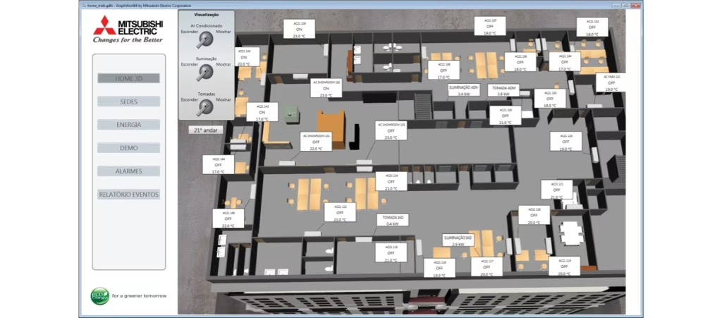
Screenshot of the old Diamond Controls Java-based interface showing a 3D Floor plan Building Connect Plus (New)
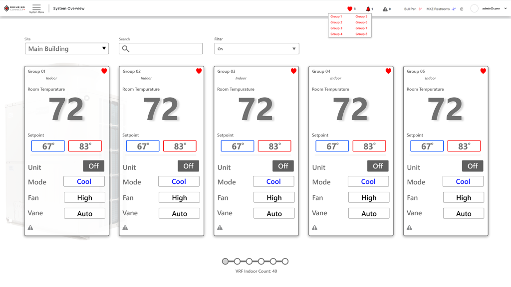
Clean, monochromatic, data-driven interface designed for rapid consumption in a NOC environment. The design strategy utilized a monochromatic aesthetic to prioritize alerts: color is reserved exclusively for critical warnings and mode status (e.g., Cool/Heat), elevating its communicative impact. Key Design Solutions
1. A Modern, Card-Based System Overview
The main dashboard was redesigned using a card-based layout where each card represents an individual HVAC unit. This allows operators to quickly scan the status of dozens of units across multiple sites, with key information (temperature, setpoint, mode) visible at a glance.
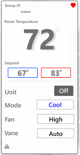
Screenshot of the new BCP System Overview showing a grid of individual unit control cards. 2. Seamless Third-Party Control Integration
A core platform requirement was managing non-Mitsubishi equipment. I designed a parallel interface that leverages the same card-based design system to control third-party devices (pumps, fans, etc.). This achieved a consistent, unified user experience, finally providing a true single pane of glass for all building management tasks.
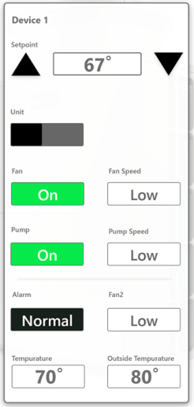
Screenshot of BCP 3rd Party Equipment control page using the same card layout. 3. Advanced Diagnostic Tools for Remote Technicians
A dedicated “Maintenance Tool” was built specifically for remote service technicians. This view provides dense, deep diagnostic data and operational values, moving beyond simple controls to enable efficient, off-site troubleshooting and system analysis.
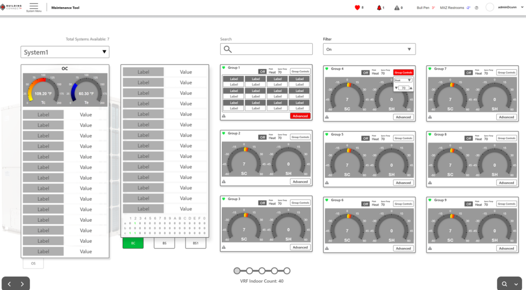
Screenshot of BCP Maintenance Tool dashboard with gauges and detailed data lists. Impact and Key Takeaway (R & L)
- Technical Debt Elimination: Successfully replaced the obsolete Java application with a modern, performant HTML5 solution, ensuring browser compatibility and device accessibility.
- Improved Usability: The new, data-driven dashboard dramatically improved operational efficiency for users in NOC environments.
- Future-Proofing: The strategic architecture and design system established a foundation that is scalable and easily extensible for integrating future innovative, third-party building equipment.
- Market Positioning: Solidified Mitsubishi Electric’s standing as a leader in innovative, smart building control platforms.
Key Strategic Learning (L)

News Platform Expansion: European News Site Market Segmentation
Project Outcomes at a Glance
Identified Key Drivers
Analysis of ESS data proved that psychographics (Political Interest, Media Trust) were stronger behavior predictors than simple demographics.
Defined “The Engaged Critic”
Identified a prime 15-20% market segment: a high-interest, low-trust user frustrated with existing media and willing to pay for quality.
Actionable Prototype Plan
Delivered a focused qualitative plan to test the prototype with 20-28 high-value users, saving time and R&D budget.
Project Details
My Roles
- Market Researcher
- Data Strategist
- UX Researcher
Project Type
- Phase 1: Research & Strategy
Tools & Methods
- European Social Survey (ESS)
- K-Means Clustering
- Regression Analysis
- Persona Development
- Qualitative Interview Planning
Project Details
The Challenge
The client had a product concept for a news site but an undefined audience. They believed demographic and socioeconomic factors were the key to understanding media usage. Without a clear target, the project risked significant R&D waste by building a product for “everyone” and appealing to no one, failing to stand out in a saturated market.
My Approach: A Mixed-Method Strategy
My goal was to provide a data-driven definition of the *most viable* target audience. The strategy involved two phases:
1. Quantitative Analysis: Use European Social Survey (ESS) data to discover *what* segments exist.
2. Qualitative Planning: Design a plan to interview those segments to understand *why* they behave as they do, directly informing the prototype.From Insight to Action
To find the opportunity, I first analyzed the ESS data to identify key variables. This confirmed that media habits (`netuse`, `tvtot`) were less correlated with simple demographics and more strongly linked to psychographics.
- I proposed a **K-Means clustering model** based on the two most powerful variables: `polintr` (Political Interest) and `trstplt` (Trust in Politicians/Media).
- This model revealed four distinct personas, which we visualized on a 2×2 matrix to make the market map clear to the stakeholders.
Market Segmentation by Country Map
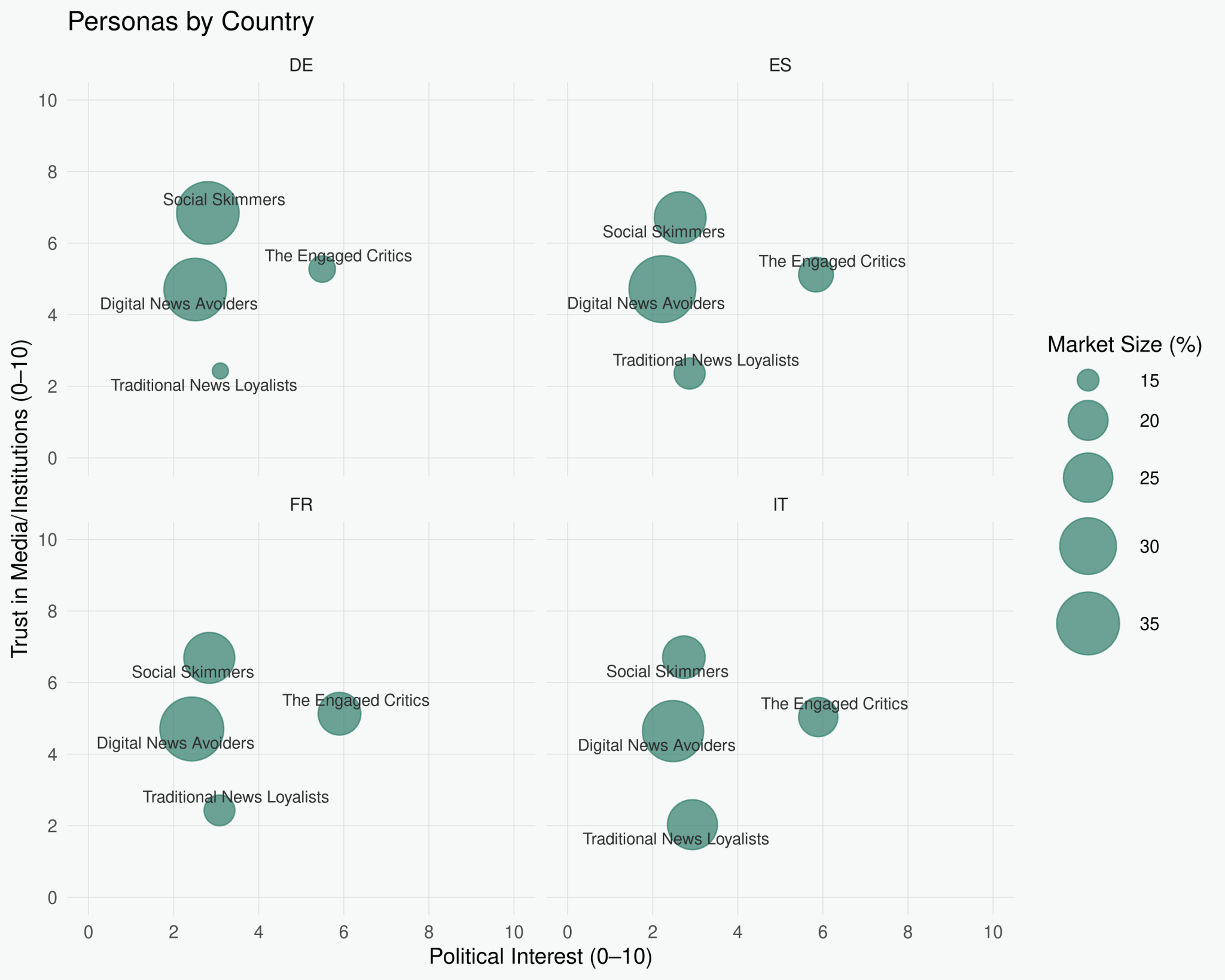
The visualization immediately showed the client where the opportunity was: not in the crowded “Traditional” or “Avoider” spaces, but in a niche of frustrated, engaged users. - The analysis proved the primary target was not defined by age or income, but by a mindset. We named this segment **”The Engaged Critics.”**
- This segment (est. 15-20% of the market) is actively interested in news but deeply distrusts existing sources, making them hungry for a transparent, in-depth alternative.
Strategic Impact
The research fundamentally shifted the client’s product strategy and provided a clear, actionable path forward, de-risking the project.
- The client’s value proposition was redefined: from “a new news site” to “**the first news source for engaged, skeptical readers**.”
- This clarity allowed the product team to prioritize features that build trust (e.g., data transparency, source-linking) over commodity features (e.g., breaking news alerts).
- I delivered a focused qualitative plan to validate the prototype with **20-28 recruits** (5-7 per country) who fit “The Engaged Critic” profile, ensuring the next phase of R&D was aimed at the right target.
Key Takeaways
This project was a powerful reminder that “who” a customer is (demographics) is far less important than “how” they think (psychographics). The client’s initial assumption—that age or income would be the key—would have led them to build a generic product for a disengaged audience.
Remediating the Lowdown iOS Design System for Accessibility & Scale
Remediating the Lowdown iOS Design System for Accessibility & Scale
Project Outcomes at a Glance
+ Task Success Rate
Reduced errors and cognitive load by creating accessible, consistent components, targeting a significant increase in task completion for pilots.
-Time on Task
Streamlined layouts and clear navigation aim to measurably decrease the time pilots spend on administrative tasks, allowing more focus on mission-critical duties.
Accessibility Enabled
Achieved WCAG 2.1 AA compliance, enabling the app to be used by all service members and meet government procurement standards for the first time.
My Roles
- Lead UX Designer
- Researcher
Timeline
8-Week Project
Tools
Figma
Technical Writing
WCAG 2.1 Guidelines
Heuristic Evaluation
Situation
This section sets the stage. Instead of just stating the project, frame it as a business problem.
Standard Entry: “The project was to redesign the user dashboard.”
Senior-Level Upgrade: “Our user retention was declining by 15% quarter-over-quarter, and customer feedback indicated the existing dashboard was a major point of friction. The business goal was to reduce churn by improving the user’s ability to find value within the first 30 days. I was tasked to lead the design strategy for this initiative.”
Key Senior Elements:
Connects the project to a specific business metric (e.g., retention, churn, conversion).
Clearly defines the problem from a business and user perspective.
Establishes your leadership role from the outset.
Task
his is where you define your specific responsibilities and the scope of the challenge. A senior designer’s tasks are broader and more strategic.
Standard Entry: “My task was to create new wireframes and mockups for the dashboard.”
Senior-Level Upgrade: “My primary task was to define the end-to-end user experience strategy for the new dashboard. This involved not only the UI/UX design but also aligning cross-functional stakeholders (Product, Engineering, Marketing) on a unified vision, scoping the MVP, and establishing success metrics, such as increasing the daily active user (DAU) to monthly active user (MAU) ratio.”
Key Senior Elements:
Highlights strategic ownership (“define the…strategy”).
Mentions cross-functional collaboration and alignment, a core senior competency.
Includes scoping and metric definition, showing you think about feasibility and measurement.
Action
This is the core of your story. Focus on why you did things, not just what you did. Describe your leadership, influence, and the strategic rationale behind your design decisions.
Standard Entry: “I started with user research, then made personas, user flows, and wireframes. I conducted usability testing on the prototypes.”
Senior-Level Upgrade: “To ensure we were solving the right problem, I initiated a mixed-methods research plan, combining qualitative user interviews with a quantitative analysis of existing usage data. The key insight was that users couldn’t find our ‘aha!’ feature. I facilitated a workshop with product and engineering leads to map out a new information architecture that prioritized this feature. I then mentored a junior designer on the team through the wireframing and prototyping phase, ensuring our design system was applied consistently. To de-risk the launch, I championed an A/B testing plan to validate our new design against the old one, focusing on a primary success metric of a 10% increase in feature adoption.”
Key Senior Elements:
Shows initiative (“I initiated,” “I facilitated,” “I championed”).
Explains the rationale behind your actions (“To ensure…,” “To de-risk…”).
Demonstrates mentorship and delegation.
Mentions influencing process, like introducing A/B testing.
Result
This is the most critical section. Quantify your impact with metrics. Tie the results directly back to the business problems you outlined in the “Situation.”
Standard Entry: “The new dashboard was launched and users liked it.”
Senior-Level Upgrade: “The redesigned dashboard launched successfully in Q3. In the following quarter, we saw a 12% decrease in user churn, exceeding our 10% goal. The A/B test confirmed our hypothesis, showing a 25% increase in adoption of the key feature. Customer satisfaction (CSAT) scores related to the dashboard improved from 3.5 to 4.7. This project directly contributed to a projected $200K increase in annual recurring revenue (ARR) by improving customer retention.”
Key Senior Elements:
Uses hard numbers and metrics (churn, adoption, CSAT, ARR).
Directly links design work to business outcomes.
Compares results against initial goals.
Learning
Show you are reflective and always improving. Discuss challenges, trade-offs, and what you would do differently. This demonstrates maturity.
Standard Entry: “I learned that user feedback is important.”
Senior-Level Upgrade: “A key learning was the challenge of aligning technical constraints with the ideal user experience. Early in the process, our engineering team flagged a potential performance issue with a proposed data visualization. In retrospect, I would involve engineering even earlier—during the initial ideation phase—to co-create solutions. This experience highlighted the importance of establishing a shared understanding of technical feasibility from day one to avoid late-stage compromises and ship a better product faster.”
Key Senior Elements:
Discusses specific, complex challenges (e.g., technical constraints).
Shows self-awareness and identifies concrete process improvements.
Demonstrates an understanding of trade-offs and cross-functional dynamics.
